Minimalism. Then Maximalism. Now, Meet the Middle Child.
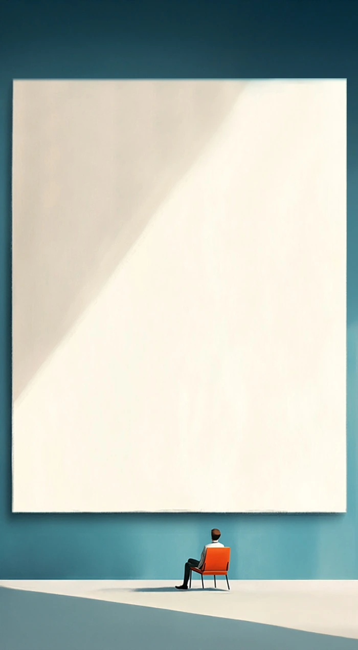
Clean lines, loud choices. This isn't your old-school minimalism.


Netflix did it with their 1-letter icon.

Apple nails it with one product, one word, one white background.

Spotify Wrapped goes bold with colour, but leaves everything else to breathe.
Balenciaga’s homepage? All black, one logo.
Bold Minimalism
Walk into a Fabindia Experience Center today. Or browse Script by Godrej. Even newer entrants
don’t just sell furniture or decor—they sell mood. A mood that’s clean, sure—but with an edge.
We’re now seeing a wave of bold minimalism. Not louder, just clearer. Not cluttered, just confident.

boAt uses vibrant blocks of colour and giant type to grab attention without overwhelming.

TATA CLiQ Luxury pairs neutral spaces with confident visuals and sharp fonts to highlight elegance.

The Whole Truth Foods removes clutter from packaging but lets bold, honest messaging pop —literally.

Sleepy Owl keeps things minimal, but the saturated backgrounds and playful icons add life and energy.
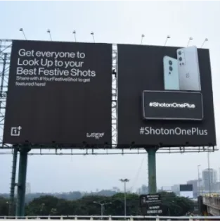
Think OnePlus’s outdoor ads: one bold claim, no distractions.

Swiggy Instamart’s latest creatives use massive type and iconography—clean layouts, loud intent.
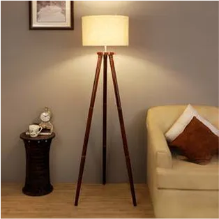
Even Urban Ladder’s top-selling decor items now include matte black lamps and brass accents —not your typical ‘white & beige’ minimalism.
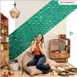
Asian Paints’ Royale Play offerings... proving that people want contrast, not chaos.
What it means for communication:
This design shift isn’t just aesthetic, it’s psychological. In an overstimulated world, the human brain craves simplicity, but it also craves novelty. Bold minimalism offers both. So, what’s driving this? We think it’s identity. And this shift is no longer confined to interiors or product design. In marketing and communication, bold minimalism is reshaping how brands speak. Scroll through any feed today—what stops you? A giant word. A bare visual. A sharp line in whitespace. All strategy. It’s not about saying less. It’s about saying it better. Big fonts. Short copy. Unexpected colour play. Confident hierarchy. Designed to cut through noise and make a point; with elegance and edge.
Our take?
Not just a design direction, but a communication superpower.
The brands getting it right aren’t trying to fill space; now, they’re owning it. And, that feels like a design choice worth making.
